South Side, Chicago
Launching August 20A political home for the South Side.
3rd Space Chicago is building a movement rooted in civics, community, and consequential action. A place where everyday people learn how power moves, and then move it.
No spam. Just launch information, events, and ways to plug in.
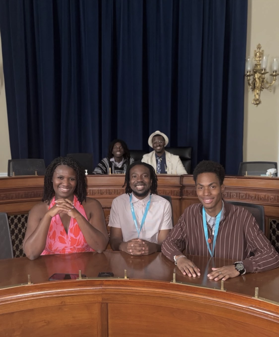
Four founders already raised a hand.
The fifth avatar is you. Every pillar below is something you help build, not something you watch.
Exhibit A — Source: ACLU
BREAKING: The Supreme Court has struck down Louisiana's congressional district map that gave Black voters a stronger voice. This is a direct attack on voting rights and the voice of Black communities nationwide.
Entered into record — April 29, 2026, 10:42 AM
Why now
The old playbook is failing. So we are writing a new one.
Black, poor, and historically silenced communities on the South Side have watched institutions they trusted fail them, again and again. Courts walk back rights won over generations. Waiting on someone else to fix it is a strategy that has never worked.
This moment demands something different: community members who understand how power actually moves, who are connected to one another in real relationship, and who act together with accountability and intention.
The Founding Articles
Power does not come from waiting.
Civic Education
The gap
People are misinformed and misguided about their own power.
The bridge
3SC creates spaces where members and community learn how to become powerful.
Community Connection
The gap
People feel disconnected from one another and from the work.
The bridge
3SC builds spaces where people can be themselves and walk out in real relationship with their neighbors.
Consequential Action
The gap
People feel like nothing ever actually changes.
The bridge
3SC centers every organizing and political effort on real change our people can feel in their own lives.
Sworn Testimony
In their own words.
Testimony — Arthur, Founder
“I am tired of people that look like me being tricked to believe they are worth less.”
With people who want to live in a city that demands Black, poor, and overlooked people see their value while rising as a community.
Arthur, FounderTestimony — Abierre, Founder
“We already have power on the South Side. We just have to create the investment ourselves so we can be independent and self-sustaining.”
Testimony — Franklin, Founder
“Third spaces have been taken from us over time. Youth have become disengaged.”
Testimony — Lee, Founder
“We need a home for people who care, physically and in their organizing.”
With other people who care deeply about this city and the people in it.
Lee, FounderThe Docket
Mark August 20. Show up.
Articles of Membership
This is not a campaign. It is a home.
3rd Space Chicago is being built by and for the South Side. There is no minimum requirement to show up. You do not need a title, a degree, or a plan. You just need to care and be willing to act.